

Well, about two weeks into the new year and it’s typically around this time that most people give up on those New Year Resolutions unfortunately. If your New Years Resolution had anything to do with personal health or diet, then this article might be for you. If not, then you should still read this article because I’m willing to bet that you consume calories of some kind. One difficulty many of us face in starting a diet is deciding what types of foods fit with our goals – whether that be to gain weight, lose weight, or just get healthy. There’s no shortage of mainstream diets that we hear about: Paleo, Atkins’, vegetarian, Low-fat, Mediterranean, Dukan, no sugar, et cetera. It seems like our understanding of what constitutes a healthy diet is ever-changing as well, and the layout of the Food Pyramid itself has shifted over the years from its initial introduction to the United States in 1992. This week, let’s try to elucidate this miasma of diet information by looking at the evolution of the Food Pyramid, the results of some of the largest food studies, and some general caveats to diet research. Dig in!
A Short Story of the Food Pyramid
Our story of the Food Pyramid begins in Sweden back in the early 1970s. At the time, Sweden was struggling with high food prices and was looking for a way to advocate for healthy diets at an affordable price for most people. It’s solution: a pyramid of three food groups that included a base of what were claimed to be “essential” foods (grains, dairy, potatoes, etc.), a center tier of fruits and vegetables, and a top tier of meat, eggs, and fish. Not only was the shape of the pyramid considered novel, but the idea that specific recommended portions were included in the graphic was also relatively new. Prior to this development, the United States did publish lesser-known dietary recommendations and visuals, but none that truly resembled the nutritional infographic that we have today.

One of the predecessors of the US Food Pyramid.
The United States caught wind of the Swedish food pyramid (among some other countries) and developed its own version in 1992. Other similar visuals around the world include Canada’s “Food Rainbow” and Japan’s “Spinning Top”.
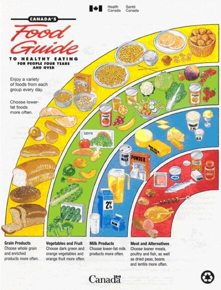
The Food “Rainbow” published by Canada in 1992 was another dietary guideline adopted as an easy-to-read graphic.

The original US Food Pyramid released in 1992.
The first United States Food Pyramid certainly had its issues. Not all of these issues stemmed from a lack of nutritional knowledge, though. Lobbyists from powerful food industries, such as meat or processed grains industries, influenced the creation of this initial Food Pyramid since a guideline for all Americans had pretty drastic implications for how people consumed their products. For example, nutritionist recommendations to show 3-4 daily servings of bread, rice, cereal, and pasta were increased to 6-11 servings per day to satisfy the grain industries. Additionally, the desire to simplify recommendations led to inaccurate messages, such as “less fat” as opposed to “healthier fats”.
Fortunately, the Food Pyramid has gone through revisions to more accurately reflect nutritionist recommendations (whilst still trying to satisfy food industries). The next major revision came with the MyPyramid in 2005, which featured bands of color with varying thicknesses to signify the relative amounts of each food group to eat along with a running stick figure to serve as a reminder to exercise. Complaints with the MyPyramid visual representation of diet included the fact that most of the important details were provided online and not spelled out on the graphic. The MyPyramid was intended to serve as a “personalized” dietary guide, but ended up losing the advantage of simplicity.
In 2011, the MyPlate stepped onto the scene as the newest dietary infographic put out by the United States. The new version included easier visualization of relative amounts of each food group and also featured catchy phrases such as “make half your grains whole”. MyPlate sticks to the same general food groups of fruits, vegetables, grains, proteins, and dairy to encompass its dietary guidelines.
Today, the MyPlate graphic is still advertised by the United States and used for dietary guidelines. For more detailed recommendations from the United States, check out the newest version of Dietary Guidelines for Americans, which has been updated every five years since 1980 (find it here: https://www.dietaryguidelines.gov/). In contrast, Harvard’s T.H. School of Public Health has released a similar infographic called the Healthy Eating Plate. Basically, the people over at Harvard School of Public Health and Harvard Medical School wanted to create an independent infographic that would not be influenced by major food and agricultural industries.

The Harvard School of Public Health version of the MyPlate dietary guideline.
Notice that in the Harvard version, dairy is replaced by water and healthy oils have been added to the mix. However you visualize it, dietary guides will pretty much always evolve as new research emerges, and they sometimes may not always fit in well with our own personalized dietary needs due to health conditions or allergies.
Nutrition & Diet Studies
While we could discuss dietary guidelines all day, it’s important to highlight some major studies that contribute to our knowledge of nutrition and what’s considered a “healthy” food:
The China-Cornell-Oxford Project

Locations surveyed in the China-Cornell-Oxford Project.
A massive study performed in the 1980s which involved 6,500 individuals living in various counties of rural China. The study involved analysis of diet, blood samples, and lifestyle surveys. A huge number of correlations were found in the resulting data related to cholesterol, cancer prevalence, et cetera. Generally, the study is used to support the assertion that plant-based diets are more suited to preventing diseases of affluence – diabetes, obesity, heart disease, cancer- compared to diets with high consumption of meat and dairy products. Critics of the study suggest that many variables are confounding or that certain important variables related to environmental conditions were not measured. Others suggest that the interpretation of the data itself was biased. Either way, this was one of the most massive health studies undertaken.
Saturated Fats Are (Maybe?) Bad For You
Many studies point towards the idea that decreased intake of saturated fats (such as those found in meat or dairy) decreases risk of cardiovascular heart disease. One such study is the longitudinal Seven Countries Study, which saw the correlation between saturated fat intake and increased risk of heart disease. Many of these studies specifically show that Low Density Lipoprotein (LDL) cholesterol, what some call “bad cholesterol”, is responsible for increased risk of heart disease. Replacing saturated fat with unsaturated fat has been shown to lower LDL cholesterol in many of these studies.
In the face of those numerous studies, the recent resurfacing of data from a Minnesota study conducted between 1968 and 1973 shows that replacing saturated fats with unsaturated fats in your diet might NOT actually lower your risk for cardiovascular disease. How can one study mean anything, though? Well, this Minnesota study was massive and randomized: it involved data from 9,423 study participants, ages 20 to 97, all living in state mental hospitals or nursing homes with controlled dietary intakes in one of two regimens. While no study is perfect, the results of the Minnesota study appear contrary to popular belief and raise some questions regarding the balance of saturated versus unsaturated fats in your diet.
DASH Studies
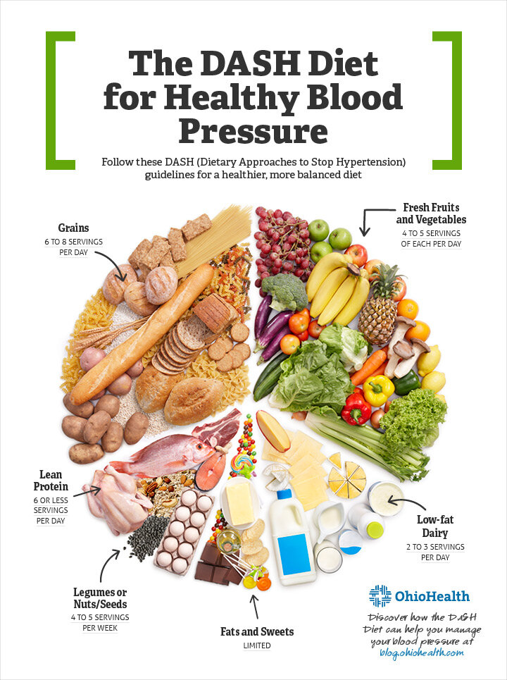
An infographic showing typical serving consumption in a DASH Diet.
Dietary Approaches to Stop Hypertension (DASH). This study started with observations of populations that exhibited low rates of high blood pressure, and involved the development of the DASH diet. The DASH diet includes large amounts of fruits and vegetables along with low-fat dairy, poultry, fish, beans, whole grains, oils and nuts, and limitation of sweets, sugar-sweetened beverages and red meats (it’s similar to the Mediterranean Diet if you’re familiar with that). The original DASH study involved three randomly assigned groups of people who engaged in different diets in parallel, with one group eating the normal “American” diet, one eating the “American” diet except with increased fruits and vegetables, and the third sticking to the DASH diet. The study involved 459 participants, and showed that the DASH diet lowered blood pressure significantly compared to either of the other dietary regimes. DASH was then extended to test the impact of sodium on blood pressure (DASH-Sodium), and the data showed that reducing sodium further decreased blood pressure in study participants. And AGAIN, the DASH study was extended in the OmniHeart study in which some carbs were replaced with protein and unsaturated fats, resulting in even greater reductions in blood pressure.
Overall, this study and its follow-up research showed that diet has an incredible influence on blood pressure, and the DASH diet itself is often lauded as one of the best diets overall, especially for a healthy heart.
Pounds Lost Study
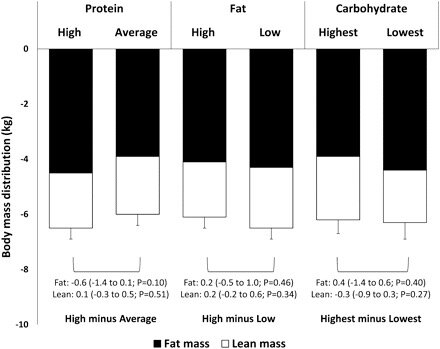
Results from the Pounds Lost study showing similar changes in body mass distribution based on varying levels of fats, carbs, and protein.
The Pounds Lost study started in 2004 and tested the effect of macronutrient content (fats, proteins, and carbohydrates) on weight loss. The study involved over 800 participants who consumed varying levels of fats, protein, and carbohydrates within a dietary plan that included an overall decrease of 750 calories consumed per day below baseline. Basically, each participant decreased food consumption, but some decreased it primarily through fats, some through carbs, and some through protein. In the end, the study found that whether participants cut their consumption of fats, carbs, or protein did not play a significant role in weight loss... simply the decrease in calories and controlled diet resulted in similar weight loss across each group after six months.
Coffee Drinking
Maybe not the most important study of health, but probably still very pertinent: how much coffee is healthy? Well, to start, drinking coffee has been shown to have some health benefits and increase longevity of life. One multiyear study conducted by the Stanford University School of Medicine suggested that coffee drinkers live longer than non-coffee drinkers. Other studies provide similar correlations of coffee consumption and longevity of life, but one study from South Australia tried to answer the question of how much is too much.
After examining data from over 300,000 participants in the UK Biobank (a massive biomedical database), the researchers found that a safe upper limit for coffee consumption is six cups per day. Too much coffee can result in issues such as arthritis. Granted, it’s difficult to determine a safe coffee consumption level based on how strong your coffee is, but this number might provide a good starting point to figuring out your own daily intake.

There are many other massive health studies out there (Framingham Heart Study, Busselton Health Study, All Of Us Research Program), and they are certainly interesting to investigate and learn more about. After all, much of the lifestyle health advice we receive is based off of these studies.
It really Just Depends
One conclusion that can be drawn from these all of this research is that nutrition is complicated, and most studies reach conclusions that are often disputed in some way. In many cases, the participants tested in dietary studies are not representative of the entire population. For example, the participants of the DASH study were all Americans who started with high blood pressure, and the participants of the China-Cornell-Oxford Project were all adults living in rural China.
The health effects of diet are much more than just the foods you eat, and personal differences may be just as important. Results from the PREDICT 1 study show large variations in how participants responded to the same meal consumed. Some participants showed rapid and sustained increases in blood sugar and others saw prolonged fat levels in the bloodstream after a meal. The study also showed that the response to the same meal varied depending on the time of day it was consumed. Gut microbiomes are even addressed in the PREDICT 1 study since the composition of the bacteria in your digestive system are increasingly shown to play a large role in health. The research shows that identical twins share only 37 percent of their gut microbes, which is only slightly more than 35 percent shared between two random individuals.
Since personal differences play just as much of a role in nutrition as the foods you eat, the idea of a healthy diet is somewhat personalized. General nutritional studies may provide guidance as to what constitutes healthy eating habits, but it’s important to look at those results as just that: guidance. After all, fully embracing a slice of chocolate cake might be better for your overall well-being and happiness in the long-run (disclaimer: this statement is entirely speculative).
To think about…
Do you think the use of “food groups” as seen on the Food Pyramid or “MyPlate” (fruits, veggies, grains, dairy, and protein) is an effective way to communicate dietary guidelines? What are some other ways that we might classify foods for nutritional purposes?
How does your own diet compare to the DASH diet described in this article? Do you think there is a diet better suited to your own dietary needs or goals (since DASH is particularly for lowering blood pressure)?
How do you balance exercise with your diet, and how should your diet change based on your level and type of physical activity?
Sources
https://www.hsph.harvard.edu/nutritionsource/healthy-eating-plate/
https://www.hsph.harvard.edu/nutritionsource/healthy-eating-pyramid/
http://www.todayifoundout.com/index.php/2013/09/invented-food-pyramid/
https://www.scientificamerican.com/article/rebuilding-the-food-pyramid/
https://www.dietaryguidelines.gov/about-dietary-guidelines/previous-editions
https://www.alimentarium.org/en/knowledge/origins-food-pyramid
https://www.ketogenic-diet-resource.com/usda-food-pyramid.html
https://nutritionstudies.org/the-china-study/
https://raschfoundation.org/wp-content/uploads/Cornell_Oxford_China-Study-Critique.pdf
https://www.wbur.org/commonhealth/2018/12/28/game-changers-diet-studies
https://www.sevencountriesstudy.com/
https://www.hsph.harvard.edu/nutritionsource/healthy-weight/diet-reviews/dash-diet/
https://academic.oup.com/ajcn/article/95/3/614/4578300
https://unisa.edu.au/Media-Centre/Releases/2020/excess-coffee-consumption-a-culprit-for-poor-health/